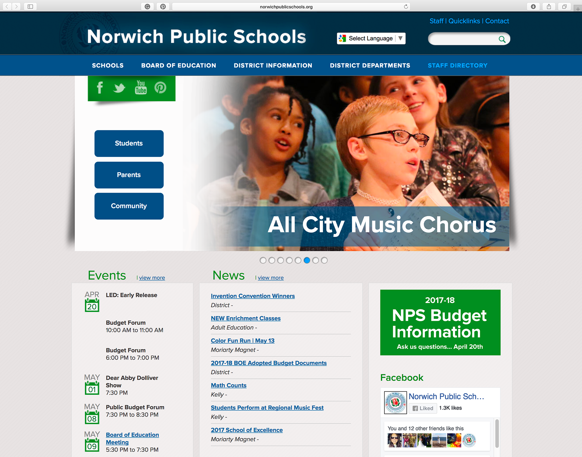
Norwich Public Schools Website
Redesign #1 in 2013

Redesign #2 in 2019
I was tasked to revamp the Norwich Public Schools' website on two different occasions. The first was to make it a more user-friendly, easy-to-navigate experience that reflected the direction they were moving towards as a district. The second time was to freshen up the look, give it a responsive website design, and make it comply with the latest ADA guidelines.
The project was a collaboration between Finalsite and me. Instead of taking on the role of a designer, I became the client. I had a very clear definition of what I was looking for and the direction it should take.
The first time the website was redesigned, I knew it needed to be clean, fresh, and timeless. The site had to utilize the blues hues that reflected the district's branding while still being kid-friendly.
The second time it was redesigned, the site needed to possess the same feel as the old website while providing a fresh new look. The goal was to give browsers the same level of familiarity and comfort with the new site as the old one.
In both cases, navigation had to be simple – only two to three clicks away; translation access needed to be highly visible; the site had to speak to three main groups - students, families, and the community; and social media was playing a significant role in outreach & communication efforts.
We required translation access to be highly visible, and it had to speak to three main groups - students, families, and the community. Social media was going to play a significant role in our outreach & communication efforts. We were just launching our media accounts and wanted to make sure our constituents knew we were connected. Links were placed purposefully above and below the fold. Navigation had to be simple and only 2 to 3 clicks away.