PHASE 1 - EXTERIOR

PHASE 2 - INTERIOR
Before & After Views and Additional Signage
PHASE 3 - MULTIMEDIA


Goal
Overhaul the look and feel, changing brand perception to entice incoming 5th-grade students to apply and attend the school.
Challenge
Increase the marketability of a school with a poor reputation, an aging building, and a challenging timeline while the theme, mission, and vision were being developed.
Strategy
Focusing on building the Build pieces concurrently starting with the initial
Process
The process began with shepherding staff to develop their magnet theme with a mission, vision, and core values. We collaborated with an outside expert in magnet schools to help guide us and provided lots of valuable feedback. I oversaw this process with my then-boss to ensure it remained on track. While the magnet theme was coming together, I did a lot of research on magnet schools. I looked at marketing, business culture, and branding elements, created a SWOT analysis of their strengths and weaknesses, sought out signage companies, took photos and videos of the property, and scoped out the competition.
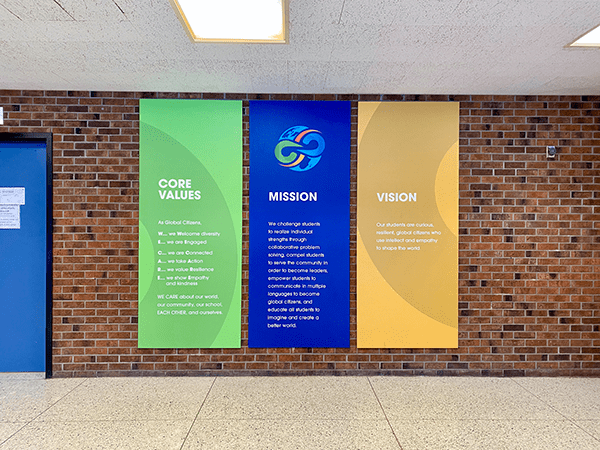
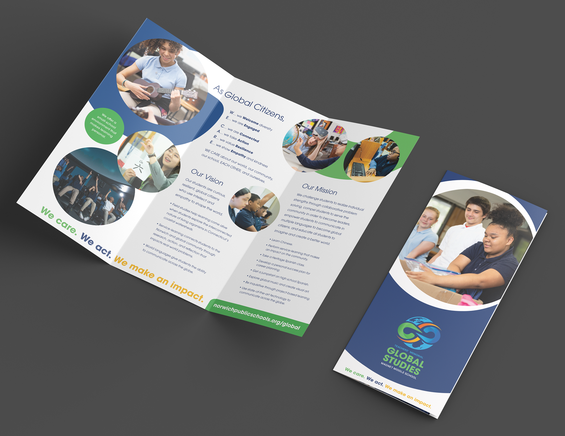
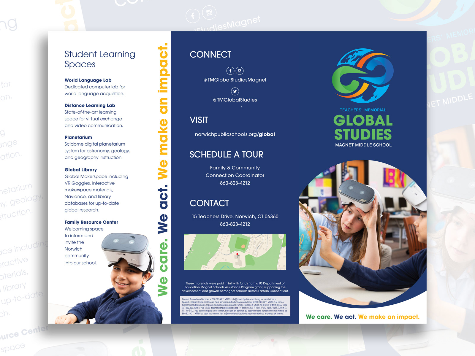
Key messages were developed by working with the staff to extract wording of what the school was and was not, how they wanted the school to be perceived, and what the school offered. This allowed the magnet team to start building their own elevator pitches while remaining consistent with school brand messaging. The messages were used to write the marketing copy for the deliverables.
Next, I contracted with an outside designer to build the core logo. I had already been with the district for eight years and knew I needed an outside perspective to prevent my biases and that of the district from coloring the brand's development. I continued to foster brand development by helping the magnet team shape and articulate their thoughts on the logo design while working with the outside designer.
Once the logo was locked into place, it was time for the creation of core deliverables. I complete them in three phases due to timeline and staffing constraints. Each phase began with consensus goals of the project and identifying key areas for change.
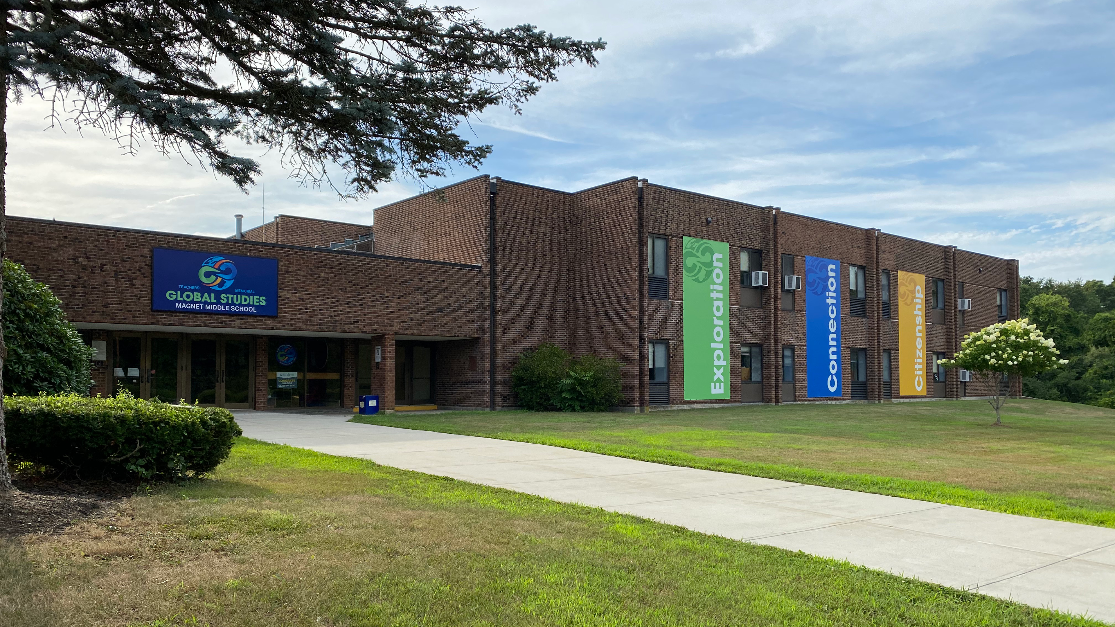
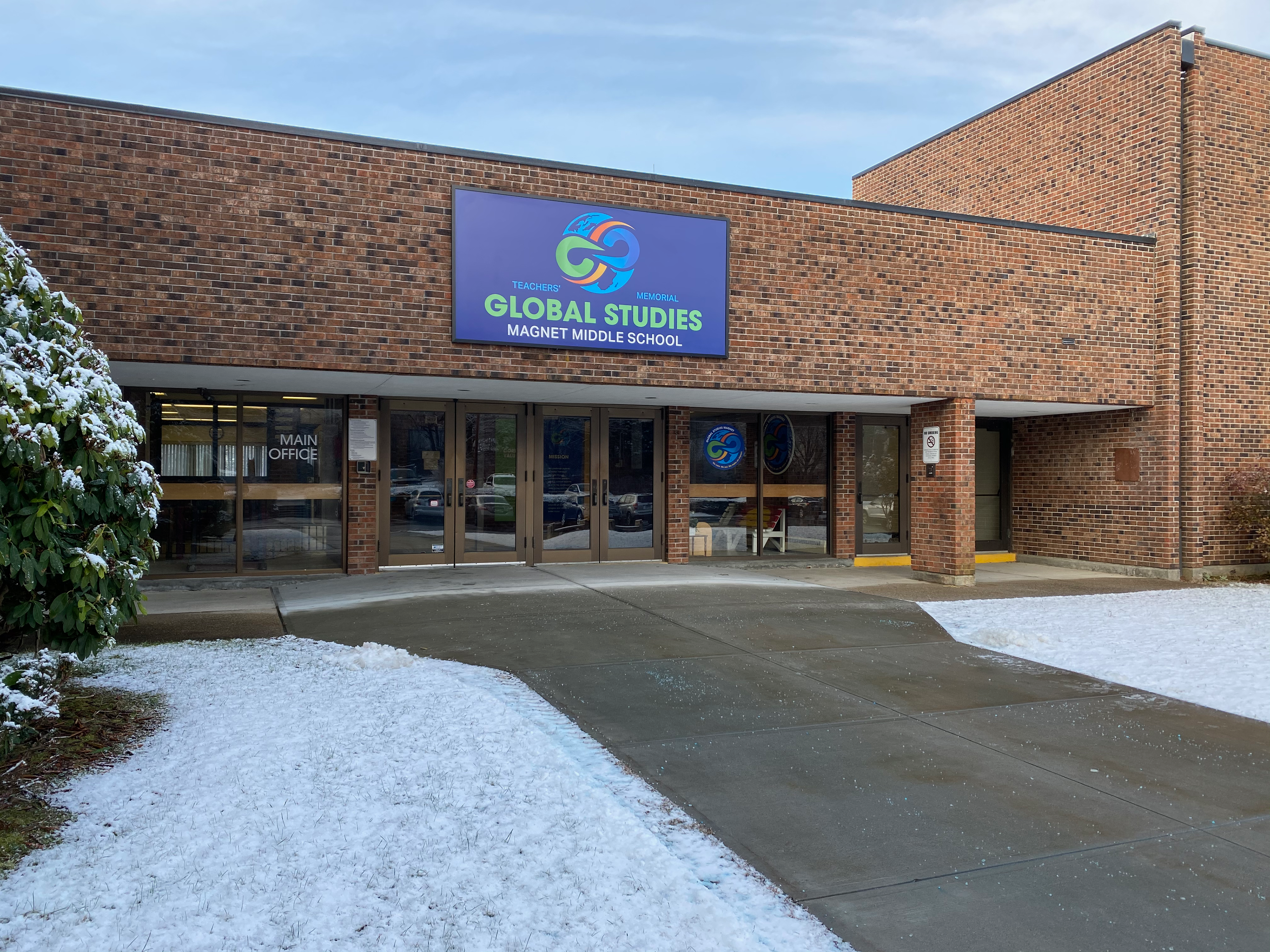
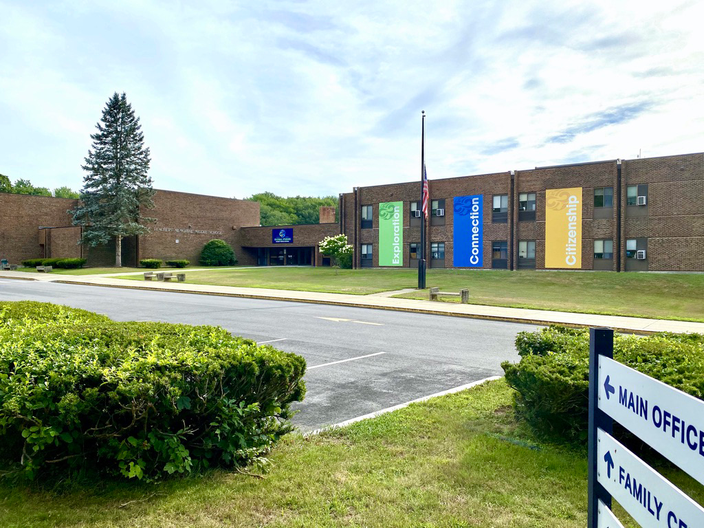
The first phase focused on the exterior of the building. Even though the building was dated, the outside was very well maintained. Signage around the building was limited and was there was a hodgepodge of design and styles with no real consistency due to lack of funding. The path to arrive at the front of the building was confusing because of where it was situated. Your first line of sight once you reach the building is technically the back and had a path that looped around either side of the school. Our goal was to create a clear understanding of where people were to go once they reached the building. A main sign was constructed with wayfaring breadcrumb guidance underneath for families and outsiders to follow. Along the path, each breadcrumb sign had an arrows to each section of the building. Once you arrived at the front of the building, there was nothing to distinguish it from any other school or building. Also the school had a reputation that it needed to change. People needed to see a big change to begin to feel the shift in mindset. I developed enormous colorful graphics to help provide the feeling of change in the areas of concentration and to reiterate the main entrance into the building. All previous window graphics were taken down and replaced with cleaner more streamlined versions.
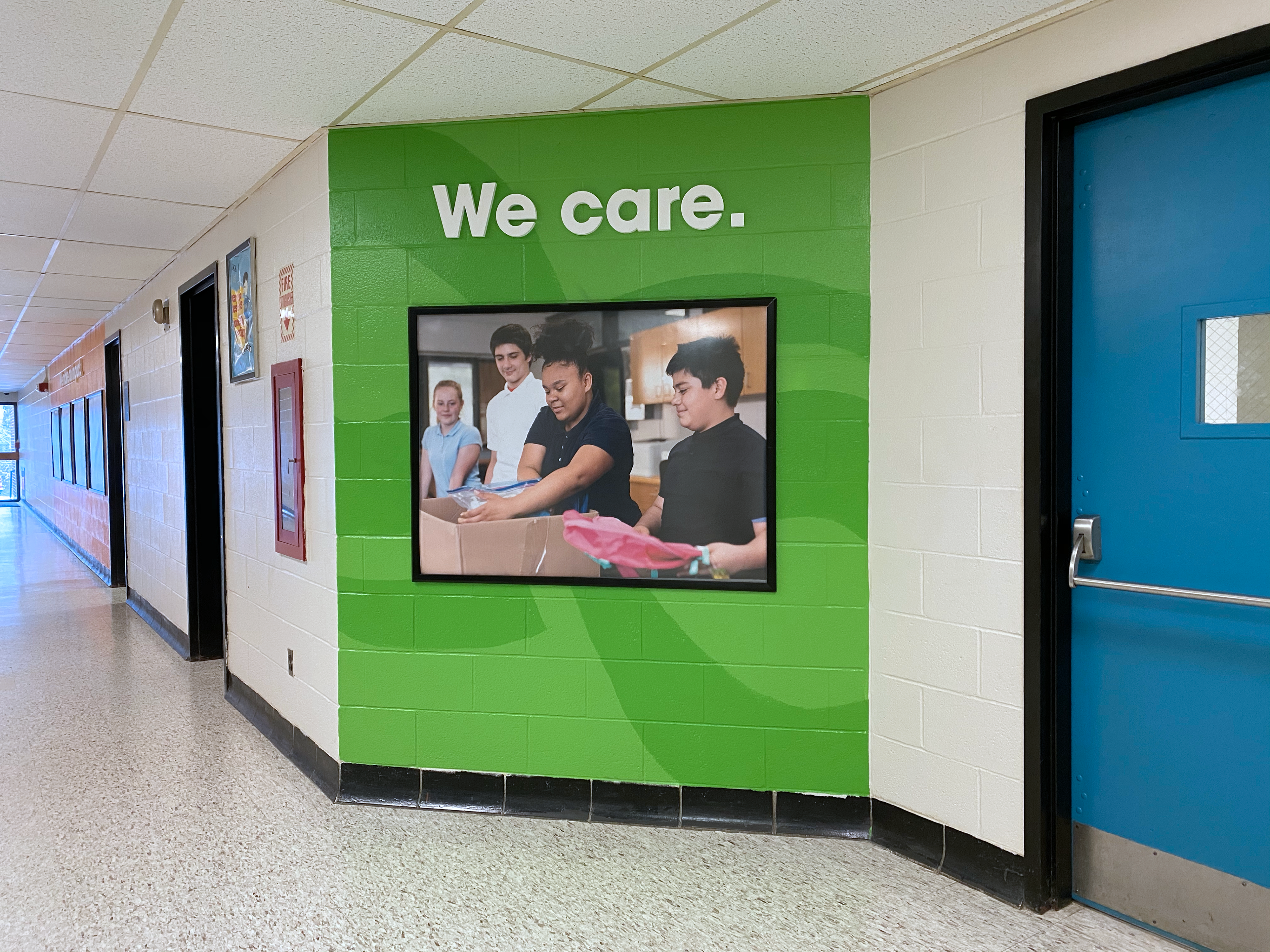
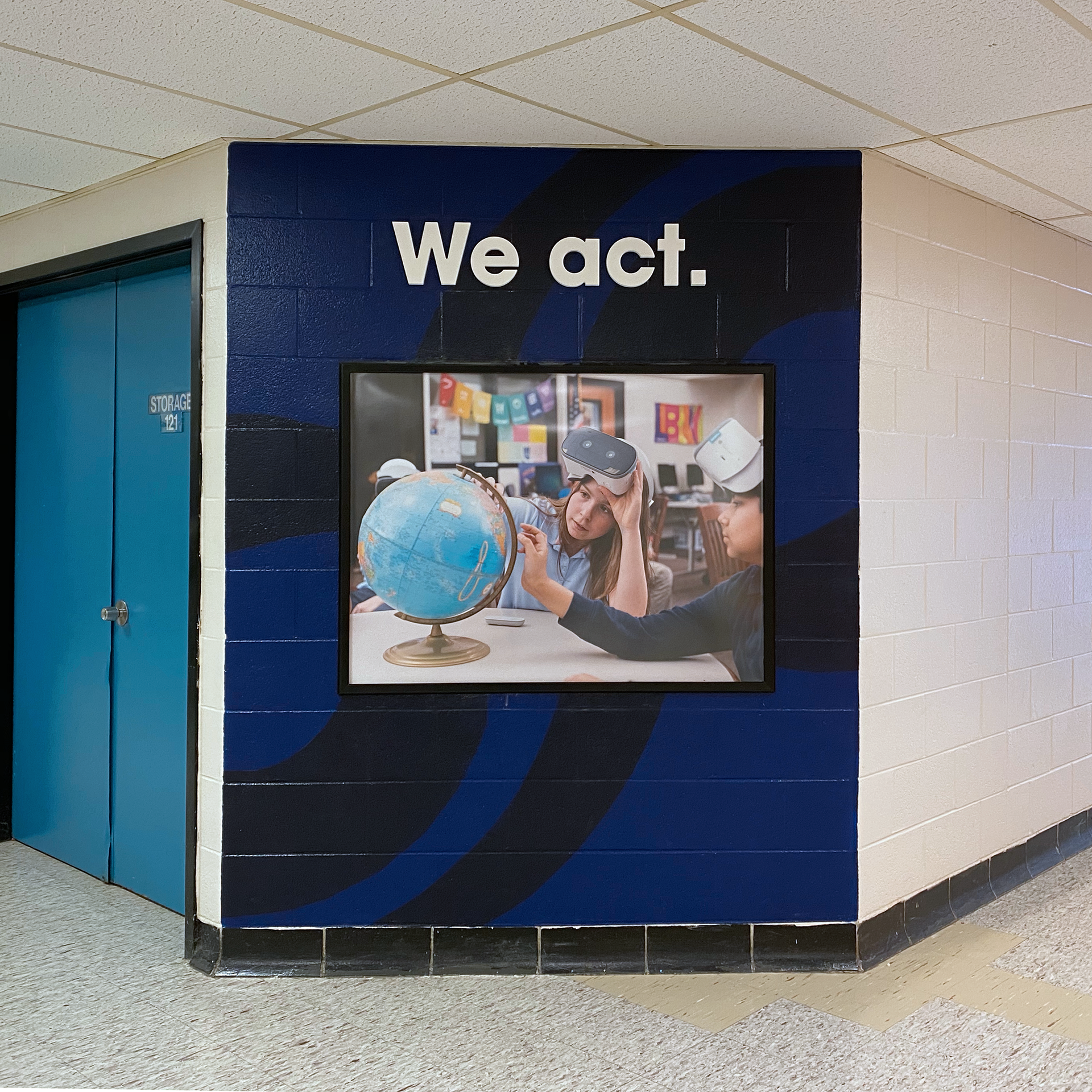
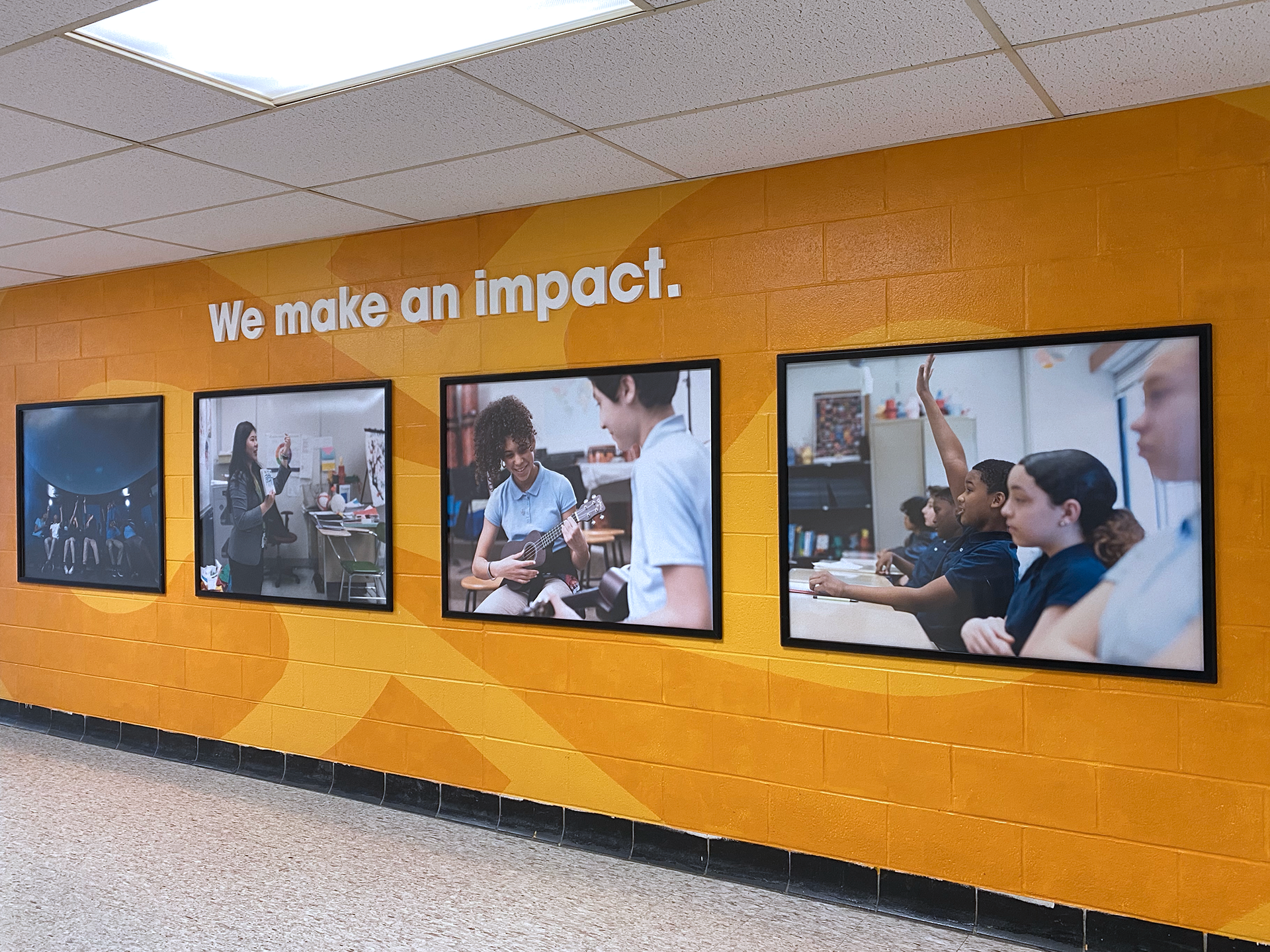
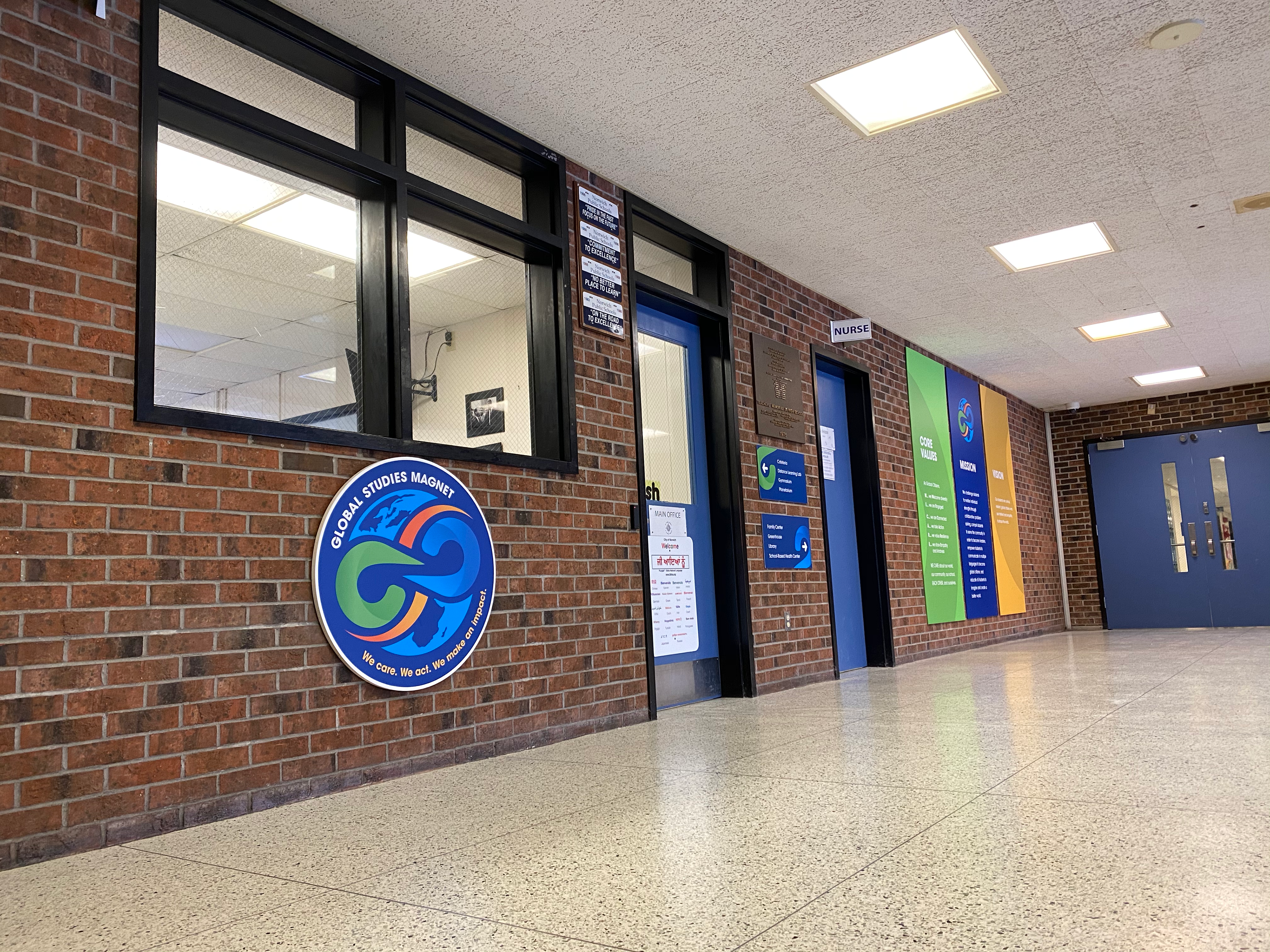
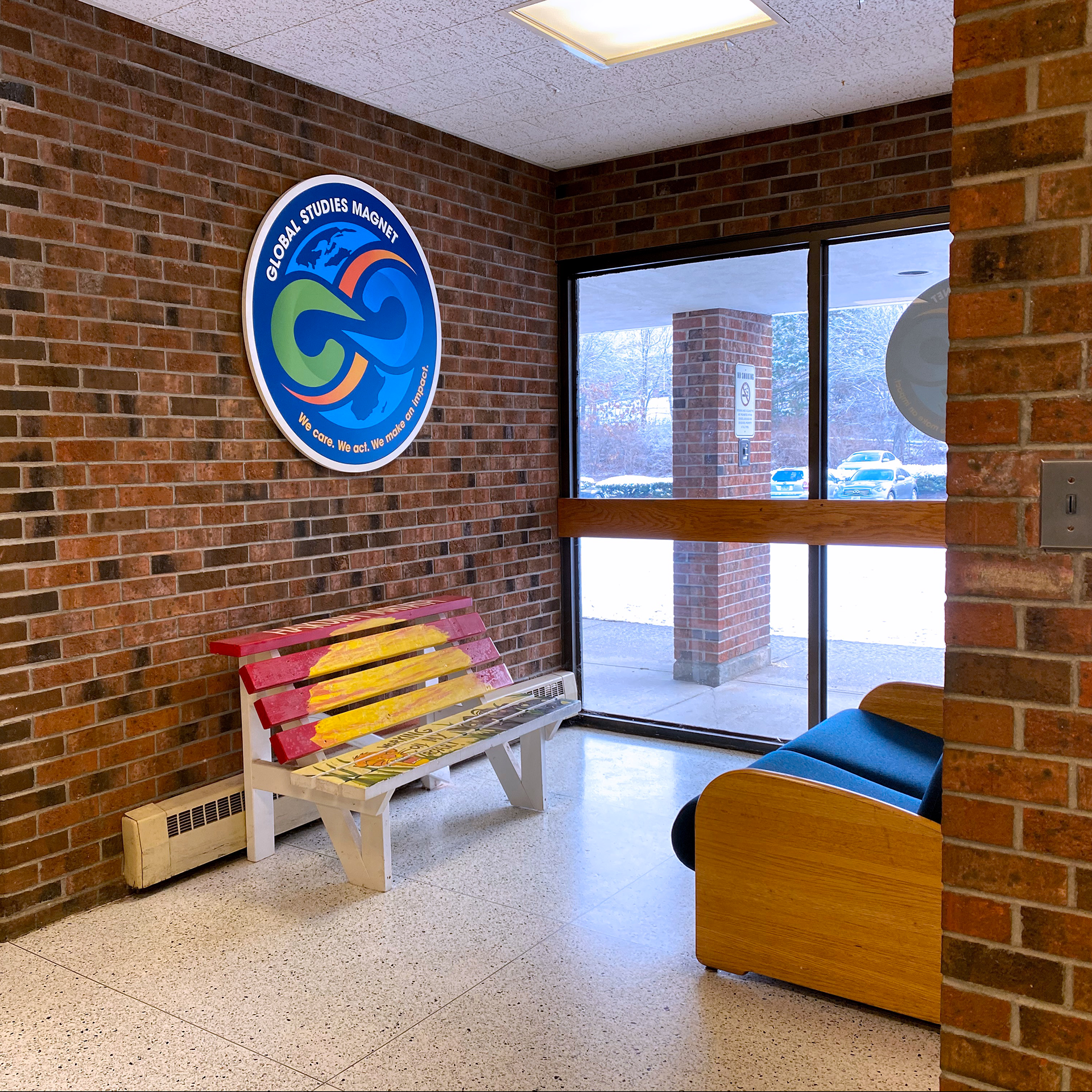
The second phase focused on the interior of the building. The key areas identified were the main lobby, walls near the cafetorium and hallways thought out to specific locations. The goal was to shift the look enough to give those highly trafficked areas building an updated feel.